Here is a quick demo on how to easily create a toggle switch with HTML, JS, and CSS. That is also Accessible.
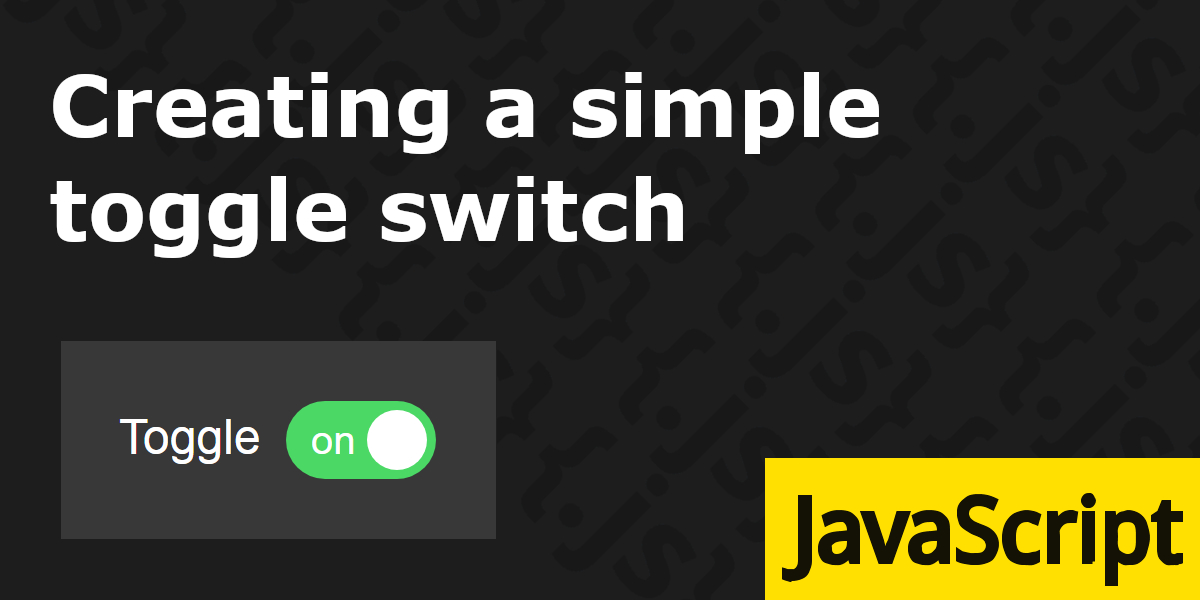
Finished product first, then I will explain it’s behaviour and how it’s made:
See the Pen Accessible Toggle switch by IpsumLorem16 (@ipsumlorem16) on CodePen.
I wanted a toggle button, that was animated, did not automatically focus on clicking it/label, while still having keyboard focus and was accessible. Plus it must look nice, because it is going into my app.
Never having made one before, I turned to the web for examples of how to implement it correctly. I found lots that looked beautiful, but did not match my needs/were overcomplicated or were just downright wrong. I finally found a great and simple(if but a bit ugly looking) implementation by mozilla, on which this is ripped based off.
Creating the element
As you can see below, the HTML is super simple. It is just a button with a couple of spans inside. one for the toggle knob(the bit that moves), and the words ‘on’ and ‘off’ (these are optional, you can style it how you like).
Above that, I included a label, telling all users what the switch is for.
<!-- label -->
<label for="toggleSwitch" class="toggle-switch">
  Toggle
</label>
<!-- toggle switch -->
<button role="switch" aria-checked="true" id="toggleSwitch" class="toggle-switch">
  <span aria-hidden="true">on</span>
  <span class="knob"></span>
  <span aria-hidden="true">off</span>
</button>
The important bit for accessibility, is the role="switch" and aria-checked attributes. These turn it into a switch that reads as on/off for screen readers, according to the required aria-checked attribute. Where true = on, and false = off, obviously.
Disabling
There is also the aria-readonly attribute, that tells the user if the on/off value can be changed. So if you want to disable the toggle switch you have to set aria-readonly="true", and style it accordingly for all other users. It’s no good just adding a visual cue and disabling the functionality in JavaScript.
It’s default value is false, and the attribute is not required. You can just add/remove aria-readonly="true". We did not include it, so it is set as false or editable on our switch .
Something else to note:
role="switch" automatically sets all child elements to role="presentation"(so do button elements..), but not text. Which you may or may not want to hide from screen readers, with aria-hidden="true".
Read more on the presentation role at w3.org or: https://timwright.org/blog/2016/11/19/difference-rolepresentation-aria-hiddentrue/
Making it interactive
Ok, now all we need to do at the most basic level is to toggle the aria-checked attribute on click with javascript:
//add click event handler to all toggle switches on page
document.querySelectorAll(".toggle-switch[role='switch']").forEach(switchEl => {
  switchEl.addEventListener("click", handleToggleClick, false);
});

function handleToggleClick(event) {
  let switchEl = event.target;
  //if not disabled, toggle attribute
  if (!switchEl.hasAttribute("aria-readonly")) {
    let currState = switchEl.getAttribute("aria-checked");
    let newState = (currState === "true") ? false : true;
    switchEl.setAttribute("aria-checked", newState);
  }
}
This checks the current state, and sets newState by using a tenerary operator to check if currState === true (getAttribute() returns strings only) and return the opposite.
Then just apply the newState to the elements aria-checked attribute.
That should work, but upon clicking, the child elements get in the way. Stop this in CSS with pointer-events: none.
button.toggle-switch span {
  pointer-events: none;
}
Preventing focus on click(optional)
I don’t want it to auto-focus on click, but still be accessible by keyboard. You can usually do this by using preventDefault() on the mousedown event so lets add that:
document.querySelectorAll(".toggle-switch[role='switch']").forEach(switchEl => {
  switchEl.addEventListener("click", handleToggleClick, false);
  //prevent focus on switch when clicking on it
  switchEl.addEventListener("mousedown", event => {
    event.preventDefault();
  });
});
That works, but clicking the label, will trigger the switch and also focus it. I want the option to change that behaviour. Doing that is actually super easy:
//add click event listener to all switch labels
document.querySelectorAll("label.toggle-switch").forEach(labelEl => {
  labelEl.addEventListener("click", event => {
    event.preventDefault(); //prevent focus
    event.target.control.click(); //activate switch
  });
});
Styling
It changes state, but looks nothing like a toggle switch yet. Lets add some CSS to the button element and label:
/*put in container & change background colors*/
body {
  background: #1d1d1d;
}
.toggle-container {
  display: inline-block;
  padding: 20px;
  background-color: #ffffff1f;
}

/*button*/
button.toggle-switch {
  position: relative;
  width: 50px;
  height: 26px;
  padding: 1px 6px;
  background-color: #d8d9db;
  outline: none;
  border: none;
  color: white;
  border-radius: 20px;
  line-height: 20px;
  cursor: pointer;
  transition: all 0.3s;
}
button.toggle-switch .knob {
  position: absolute;
  width: 20px;
  height: 20px;
  border-radius: 50%;
  background-color: white;
  top: 3px;
  left: 3px;
  transition: all 0.3s;
}
label.toggle-switch {
  margin-bottom: 4px;
  margin-right: 4px;
  font-family: Arial, sans-serif;
  color: white;
  user-select: none;
}
This removes default styling of the button, rounds it out, and turns the .knob span into a circle, positioned inside on the left. This is also how it will look when in the off position.
The transitions are for switching the background color, and moving the knobs position on state change.
Also put the widget in a padded container, and changed the background styles to something darker.
Changing state
We need to change how it looks in different states(on/off). The off state is basicly done so all we need to style the ‘on’ position, and we can do this by using an attribute as a selector: .toggle-switch[aria-checked="true"].
So that when the user activates the switch, changing its attribute from true/false this automatically changes the styling:
button.toggle-switch[aria-checked="true"] {
  background-color: #4bd865;
}
button.toggle-switch[aria-checked="true"] .knob {
  transform: translateX(24px);
}
Cool, that moves the toggle knob, and changes the background color.
I also want to make sure the on/off text can’t ever peek though, in case I ever change the style/size of the widget:
button.toggle-switch[aria-checked="true"] :last-child {
  opacity: 0;
  transition: opacity 0.2s 0.1s;
}
button.toggle-switch[aria-checked="false"] :first-child {
  opacity: 0;
  transition: opacity 0.2s 0.1s;
}
Lets add styling for when the switch is entirely disabled. Which you can do by setting it’s attribute .toggle-switch[aria-readonly="true"]. This locks it in whatever state it is currently in, but in an accessible way:
button.toggle-switch[aria-readonly="true"]{
  cursor: not-allowed;
  opacity:0.8;
  filter: grayscale(50%);
}
Focus styling
I’m not a fan of the super thin/dotted line that gets applied to elements on focus. Especially mozillas weird implementation of :-moz-focus-inner, that applies an outline to elements even though you have already defined your own :focus styling.
Instead I want a slightly thicker and bold outline, that is easier to see and looks nicer:
button.toggle-switch:focus {
  box-shadow: 0px 0px 0px 3px #fff;
}
/* hide outline & other weirdness on focus on firefox */
button.toggle-switch::-moz-focus-inner {
  border: 0;
  outline: 0;
  padding: 0;
}
Setting the border: 0; removes the focus ring in firefox, setting the outline and padding prevents any potential weirdness in sizing see here: https://www.kihlstrom.com/2016/firefox-button-padding-css-fix/
Done
That’s it, And it can easily be changed to adjust styles, sizes, add icons for example:
See the Pen Accessible Toggle switch [different styles] by IpsumLorem16 (@ipsumlorem16) on CodePen.