This article is intended for anyone who wants to try SVG animation, but has no idea where to start.
Hopefully giving you enough information to get going, without being too shallow nor getting lost in the weeds. As well as pointing you in the right direction for when you are ready to learn more.
You should already have a basic grasp on CSS animation and keyfames to follow along some of the examples.
Contents
This article is split into two parts. First a little bit about SVGs and how to use them, and then the main point of this article, how to get into Animating them.
Click below to skip to wherever you wish to start.
About SVGS:
Animating:
What is SVG?
SVG or scalable vector graphics is a vector image format, built using XML. A markup language that looks similar to HTML.
Vector images are different than raster images such as, .jpg, .gif, .png, .bmp. Which uses a grid of pixels(bitmap) to make an image. Whereas vectors use algorithms to define geometric shapes and paths that are then used to generate the image on screen. Because of this SVGs can be scaled to any size without blurring.
Like HTML, SVGs can contain multiple different elements, such as <circle>, <rect>, <line>, <path>, and more to combine into a single image. You can even include <text>.
Why use on the web?
SVGs are hugely flexible and have many uses on the web while offering a lot of benefits over traditional images. As well as being widely supported in all current browsers.
Benefits include:
- Smaller file sizes
SVG often has smaller file sizes than raster images. - Less HTTP requests
When using inline SVGs, meaning even faster load times. - Infinitely scalable/shrinkable
Stays crisp with no distortion at any size. Unlike when resizing JPG ,GIF, or PNG. - Manipulate
You can use CSS and javascript to interact with them.
Uses
There are lots of places to use SVG, some common uses:
- Logos
Use the same logo in multiple places with a different look. Edit text, colours, or swap from solid to outline only. - Icons
Crisper, no anti-aliasing means no more blurry icons. And with the ability to animate any part of the icon, you can create meaningful micro-interactions. - Illustrations
Simple illustrations, inplace of raster images. Are very popular right now, especially of humans doing things. A great alternative to stock photography. - BackgroundsCreate cool, repeating tiling backgrounds, without loading any extra resources.
Like this
How to create your own SVGs?
The most common tools used to create and edit svgs:
- Inkscape – A free and open-source vector graphics editor.
- Adobe Illustrator – Paid vector graphics editor.
- Sketch – Paid UI/UX design tool for macOS, can be used to make SVGs.
- Figma – A browser-based UI and UX design application, that can also be used to create SVGs. It is free to use for a basic account.
If you are not familiar with inkscape or illustrator, I would suggest using Figma. It has a much simpler interface. And in my opinion is much faster to design and create SVGs.
Optimising
Luckily Figma, has prioritised exporting clean simple SVGs, and should be ready to use right away. Without the need for optimisation.
But if you export your SVG from a graphics editor, it might be a bit bigger than it needs to be, with lots of useless (to us) extra stuff in it. This makes the file unnecessarily bigger, and also harder for humans to read. Not helpful when we want interact with it.
You can use tools to clean it up automatically for you. One great one is svgomg by Jake Archibald. An online version of SVGO but with a GUI.
Finding svgs to use
You might not have time to, or even want to create your own from scratch. Here are some resources for free SVGs, that you can also use:
- undraw.co – Free Illustrations of humans doing various things, good for landing pages. Can be animated…
- pixabay.com – Free images and stock, with ability to search for vectors. Good for finding Illustrations, and useful shapes/bits to edit or combine to help create your own SVG
- fontawesome.com – for free SVG icons.
Getting it onto the page
There are multiple ways to use SVGs.
- Adding it directly to the page with inline SVG.
- Linking to the source file/using a data url, and using it in elements like:
img,object,iframe,embed - You can also set SVGs as a background image in CSS.
But there are limits on how you can interact with it, based on how you added it to the page and where it loaded from. The most flexible, and what we will be using in this tutorial, is inline SVG. Where you add it directly into the HTML like this:
See the Pen SVG inline example by IpsumLorem16 (@ipsumlorem16) on CodePen.
To get the XML from your SVG file, you can simply open it in a code editor and then copy and paste that into your HTML.
Or open it in your browser and use inspect element to see the XML.
CSS, Keyframe animation
Like HTML you can select any element within your SVG.
To animate a specific part you need to add id to the element, making it possible to target with CSS. For multiple elements you can use a class. You can also group elements by wrapping them in <g> tags.
You can do this by hand, editing the XML yourself. Or you can use use the same layer labels, and grouping from within your SVG editing tool.
I do it in the figma web-application by making sure the “Include ‘id’ Attribute” checkbox is selected in the export options. This is often simpler than looking though tons of parts on more complex illustrations.
Here is an example of an svg with added ids, classes and groups. It looks basicly the same as HTML.
See the Pen simple SVG shapes by IpsumLorem16 (@ipsumlorem16) on CodePen.
You can animate this in similar ways you would normal HTML elements. Changing colours, opacity, etc. But there are a few differences, Instead of background-color use fill, and to manipulate the border you have stroke (and stroke-width / stroke-dasharray /stroke-dashoffset). Also css filters do not work on SVG. instead you would have to use the incredible but somewhat tricky SVG filter.
You also have the ability to add changes on CSS :hover & :active. Or even by adding Javascript event listeners. This can be on any element, not just the whole SVG.
First animation
Ok, jumping right in…
Lets animate those same shapes with CSS:
See the Pen simple SVG shapes [animated] by IpsumLorem16 (@ipsumlorem16) on CodePen.
You can see the triangle bouncing up an down, using its id #triangle as a CSS selector I added a simple keyframe animation:
#triangle {
  animation: moveUp 1s infinite alternate;
}
@keyframes moveUp {
  to {
    transform: translateY(-10px);
  }
}
I also made it interactive by adding a :hover effect to the group <g> of <rect> elements, and a colour change on click with :active on #circle:
#squares:hover {
  opacity:0.4;
}
#circle {
  transition: all 500ms;
  cursor:pointer;
}
#circle:active {
  transition: all 200ms;
  fill: #f14e4e;
}
You can see just how easy it is to add animations to SVG, is it not at all dissimilar to what you are already doing with HTML.
Second animation – something a bit more complex
I mentioned the stroke property before. There are lots of ways of animating its properties for different effects (like a linedraw animation). One cool thing I discovered is to change stroke-dashoffset to create a chainsaw animation.
See the Pen SVG Chainsaw CSS animation by IpsumLorem16 (@ipsumlorem16) on CodePen.
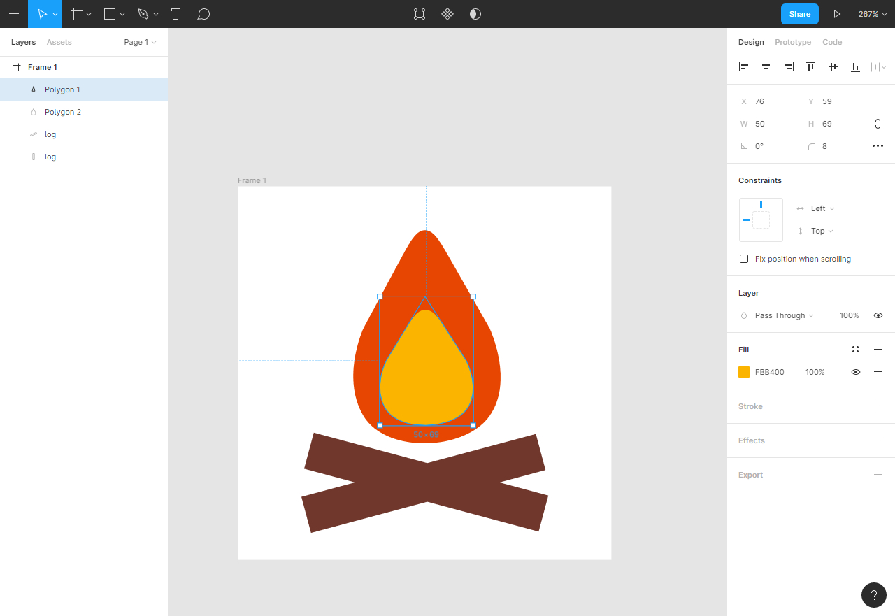
Animating the blade
Using those stroke properties, I first made #blade look like it has a chain. Setting stroke-dasharray="33" gives it the ‘teeth’. They didn’t look linked to anything though, so adding a duplicate element on top with only a solid outline makes it look like the dashes are joined, and thickens the ‘chain’.
I did this in Figma, thats why they are set as attributes in the XML, but you can add stroke-dasharray in CSS too.
<rect id="blade" x="131" y="67" width="172" height="29" rx="14.5" fill="#CCD6D8" stroke="#4D4D4D" stroke-width="3" stroke-dasharray="3 3"></rect>
<rect id="outline" x="132.5" y="68.5" width="169" height="26" rx="13" stroke="#4D4D4D" stroke-width="3"></rect>
And with stroke-dashoffset you can move those dashes along. Because stroke-dashoffset defines the point where the dashes begin, If we animate that property, it looks like the chainsaw is running. Here is how I did that:
/*targeting the blade element within the SVG*/
#blade {
  animation: spinblade 2s infinite;
}
@keyframes spinblade {
  /* adding the final value at 50% and 100% means we can
     have a pause in between the blade spinning   */
  50%, 100% {
    stroke-dashoffset: -90;
  }
}
Setting it at a negative number, so the chainsaw is running in the right direction.
Adding some engine movement
Moving the chain alone looks a bit dull, I wanted to also make it look like the engine was running. So added some movement to the group elements #fins and #engine_front
This keyframe, moving up and down 2px has #engine_front really shaking:
#engine_front {
  animation: engineMovement 100ms infinite;
}
@keyframes engineMovement {
  to {
    transform: translateY(2px);
  }
}
I could not get a pleasing look with translate on the engine #fins so instead used scale to give it a shake too, albeit a bit slower:
#fins {
  animation: engineMovement2 250ms infinite;
}
@keyframes engineMovement2 {
  to {
    transform: scale(1.01);
  }
}
Thats all for the chainsaw, 3 keyframe animations. Hopefully this section gives you an idea of what is possible with CSS.
Common issues
Now lets look into some issues you might have..
Transform origin
Using CSS transforms with SVG can be a hassle, and there are inconsistencies across browsers. Along with 3d transforms on SVG not yet being widely supported
The issue with SVG is that the co-ordinate system is not the same as in HTML. In HTML it starts at 50% 50% on the element. In SVG it starts at 0 0, the top left of the SVG.
This causes rotate, scale and skew to behave differently. As you can see in the codpen below, the rectangle within rotates from the top left corner of the SVG.
See the Pen SVG CSS transform rotate demo by IpsumLorem16 (@ipsumlorem16) on CodePen.
To correct this you can set the css property transform-origin on the element, but you need to use pixel co-ordinates for maximum browser compatibility. To get the X,Y find the point from the top-left of the SVG to where your element is, you can find this in your SVG editor.
After applying the values transform-origin: 150px 100px; We can get it to rotate around its center.
See the Pen SVG CSS transform rotate demo (fixed with transform-origin) by IpsumLorem16 (@ipsumlorem16) on CodePen.
There is a really in depth article on CSS tricks that covers this, if you want to dive deeper on the issue: https://css-tricks.com/transforms-on-svg-elements/
There is no z-index
Not in SVG 1.1 at least. SVG 2 is supposed to be adding it in the future…probably.
SVGs are flat 2D world and elements are painted onto the page in the order they were defined. The first element is rendered first, the second is stacked on top of that, and so on. You cannot bring an element above another without using JavaScript.
To bring something to the front, or move it behind something else, you have to change the order of the elements within the SVG.
Animation Libraries
There are a few libraries you can use with SVG that will make it easier to make more complex animations.
Greensock
I would highly recommend this Javascript library if you want to get serious about web animation.
Website: https://greensock.com
This is a tool the professionals use. Not only does it completely fix the transform-origin issue (and others), it is high performance, well documented, and has a large and active forum. You can quickly get started with it on codepen along with all of its plugins:
See the Pen Animated SVG heart button by IpsumLorem16 (@ipsumlorem16) on CodePen.
Mostly free to use, but requires a license for certain situations:
GreenSock uses a very permissive license that allows you to use the tools for free for everything except a very specific type of commercial use (if you collect a fee from multiple customers for the same app/product/site that uses GreenSock tools)
– https://greensock.com/club/
With greensock, you have the ability to sequence multiple animations, with timelines. Timelines themselves are completely controllable, and it ends up greatly simplifying things. There no need to mess with multple CSS delays for your complex animation. With timelines you can:
- Set the exact point when each animation should start
- Control it with
play(),pause()andreverse() - Speed up and slow down with
timescale() - or set an exact
duration()of your timeline/tweens - add repeat delays, something not possible with keyframes(it can be done in a hacky way, but there is no CSS rule)
- Fire events when the animation is done with callbacks, or even at set intervals.
Combine with scroll magic for more incredible user interaction.
Anime.js
A great and free animation library released under the MIT license.
Website: https://animejs.com
Github: https://github.com/juliangarnier/anime
Anime.js (
– Anime.js/ˈæn.ə.meɪ/) is a lightweight JavaScript animation library with a simple, yet powerful API. It works with CSS properties, SVG, DOM attributes and JavaScript Objects.
It includes some specific support for SVG like, animating along a path, line drawing, and basic morphing.
And like Greensock it has timelines, with the ability to play, pause, and reverse animations. You can also do staggers.
The only downside is it does not normalise transform-origin on SVG elements like Greensock meaning you will have to manually find what px you need and set it yourself.
Lottie
This is a very cool and newer set of tools, that can help you create much more realistic animations, especially character movement. Created by airbnb, it is completely free, but you do need to have Adobe After Effects subscription.
Lottie is a library for Android, iOS, Web, and Windows that parses Adobe After Effects animations exported as json with Bodymovin and renders them natively on mobile and on the web!
– http://airbnb.io/lottie
To play the animations on the web you need to use their player, it is less dynamic than the other libraries but you can still play(), pause(), stop(), setSpeed() and reverse with setDirection(). You can also trigger events on complete.
Finding ideas and inspiration
It’s easy to get stuck. Where to start, what to animate and how. Not to mention setting the timing, easing, and sequences on your animation. I find it really helpful to look at other peoples work, and how they have implemented certain things. Here is a list of places to check out, and people worth following:
- lottiefiles – You don’t have to actually be using lottie to get inspiration from them. Search from tons of cool animations.
- Dribble – Lots of designers and teams like to show off their best work on dribble.
- behance – SVG animations on behance.
- https://codepen.io/chrisgannon – Chris Gannon, award winning animator, illustrator and interactive designer.
- https://codepen.io/aaroniker – Aaron Iker , Designer and front end developer.
Also you should try and understand the 12 principles of animation, if you want to seriously get into animation: