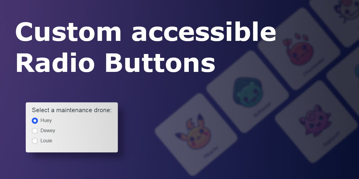
A short tutorial on how you can style custom radio inputs, instead of using the browser defaults, while keeping it completely accessible.
Basic Example
Here is my basic example of a styled radio input, it is a modified version of the standard example used in the mozilla web docs on radio inputs.
See the Pen Simple custom radio buttons by IpsumLorem16 (@ipsumlorem16) on CodePen.
(You can also just copy and use/modify this basic example if you like.)
The trick to creating custom radio inputs is pretty simple, all you need to do is; hide the standard input, put a faux radio input inside the label, and add some custom style based on the input state. That’s it really.
But there are a few things you need to keep in mind:
- You should only visually hide the radio input element
Visually hiding keeps it keyboard accessible by staying the page, but hidden from view. Users can still activate it by clicking on the<label>. - You need to put the label directly after the radio input
This allows us to use CSS to style the label based on the:checkedor:focusstate using the Adjacent sibling combinator:+. Essential for our faux radio input. - Group your radio buttons into a
<fieldset>element
And add a<legend>. This is the correct way to give context to your radio buttons for both non and visually impaired users. - You can put other stuff inside your label
Adding images or icons is fine, but hide anything that is not useful to screen reader users witharia-hidden="true".
Recreating the basic example
With that in mind here are the steps to recreate the radio input:
Hiding the Input
Start by hiding the radio inputs using the visually-hidden class. Which I copied from a great post here on the a11yproject about visually hiding content.
.visually-hidden {
  clip: rect(0 0 0 0);
  clip-path: inset(50%);
  height: 1px;
  overflow: hidden;
  position: absolute;
  white-space: nowrap;
  width: 1px;
}
Adding your own input
Then add a faux radio input by putting a <span> within the <label>, And styling it to look like a hollow circle.
<label for="huey">
  <span class="input-circle"></span>
</label>
.custom-radio .input-circle {
display: inline-block;
margin-right: 8px;
width: 21px;
height: 21px;
border: 2px solid lightgrey;
background: white;
border-radius: 50%;
transition: border 150ms;
}The transition: border 150ms will give it a nice effect when changing states.
:checked styling
Right now the faux radio input is just an empty circle, even if you click on it, useless..
But, styling the checked version is easy using the adjacent sibling combinator selector + .
.custom-radio input:checked + label .input-circle {
  border: 6px solid #275efe;
}
This will change the border colour and thickness. Giving it a thick blue border, when :checked.
This works because even though the input is actually hidden, clicking on the label will still automatically change the input state. And since the <label> is an adjacent sibling we can style it and its children, based upon the current state with psuedo-class selectors such as :checked.
(Don’t forget to add unique-id’s to the inputs, and an for="unique-id" attribute to the label or it won’t work.)
:focus styling
It is important to add focus styling for all custom inputs for accessibility. Since we have hidden the original input, there is nothing visually showing where keyboard focus is if you tab to it, or click on it. We need to replicate the original expected behaviour.
You can do this by using the adjacent sibling combinator selector (again), to add a light blue border around the .input-circle:
.custom-radio input:focus + label .input-circle {
  box-shadow: 0px 0px 0px 2px #91b1f3;
}
(Technically it is not a border, because we already have one, but a non-blurred box-shadow works just fine.)
That is basically it, the rest of the CSS is just for positioning, and styling. You might also want to add :disabled styling if you need it, but I’m sure you can figure that out.
More examples:
You can get really creative with your radio inputs, adding images and making them look more like buttons. Here are some other examples I made:
See the Pen Custom Accessible Radio buttons (emoji) by IpsumLorem16 (@ipsumlorem16) on CodePen.
See the Pen radio selector for Pokemon by IpsumLorem16 (@ipsumlorem16) on CodePen.