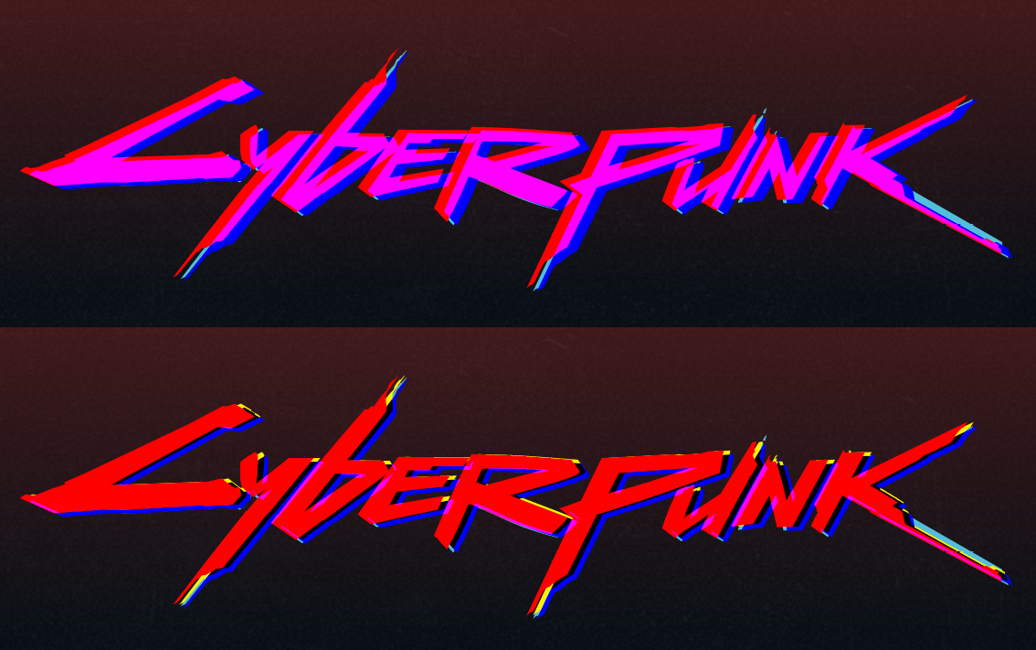
See the Pen Cyberpunk animated SVG logo {fork} by IpsumLorem16 (@ipsumlorem16) on CodePen.
Try holding down the mouse-button, and clicking/hovering over the logo.
In this post I will describe how I used SVG filters, CSS and GSAP to create my own version of the animated cyberpunk logo.
This is not really a ‘how to’ or tutorial, more of a post explaining what I did. Since this was mostly just a lot of trial an error.
Warning, this is a pretty long winded post…
The final effect is made up of several filters and animations joined together
- Recreating the logo in SVG
- Learning to use SVG filters is kinda hard..
- Filter 1: Chromatic Aberration
- Filter 2: Distortion effect
- The Background
- Dirt + colour background
- Glowing outline
- Background Noise (SVG Filter)
- Animated background lines (SVG Filter)
Recreating the logo in SVG
This is not really necessary, since SVG filters can be applied to any elements on the page. Including divs and images. I initially did this to create a more complex animation that would require two layers, and access to each letter. But I ran out of time working on this. and had other work to finish…
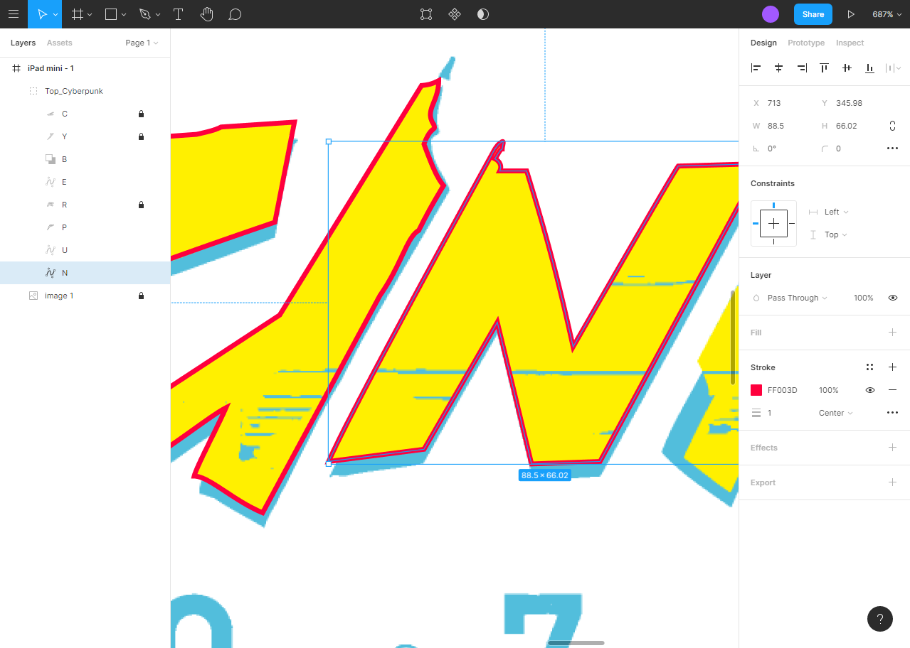
All I did is find a high quality raster image of the logo and pasted it into figma, allowing me to trace each ‘cyberpunk’ letter using the path tool. I duplicated this and tweaked the path for the bottom layer. Again this is not necessary, you can use any image of your choice.
Learning to use SVG filters is kinda hard..
At this point I had used a SVG filter maybe once before (…and that was an entirely copy and paste job). I was determined to learn how to use them properly this time around.
It was hard to find easily digestible info on learning about SVG filters on the web, or how to animate them. The documentation itself is kind of dense. But there were a few resources that really stood out and helped me that I would like to share:
- The excellent ‘SVG filters 101’ series at codrops.
- Steven Bradley of Vanseo Design
He has (a lot) of blog posts on SVG and filters with plenty of examples. Especially helpful are his introduction to svg filters posts.
(But, it is not organised too well. You can find what you want by appending the url with?s={your search term}eg: http://vanseodesign.com/?s=svg%20filter) - This SVG filter building tool svgfilters.client.io
May help some people visualise and to understand how they work better. (To be honest it did not help me that much, but it is a cool tool nevertheless.)
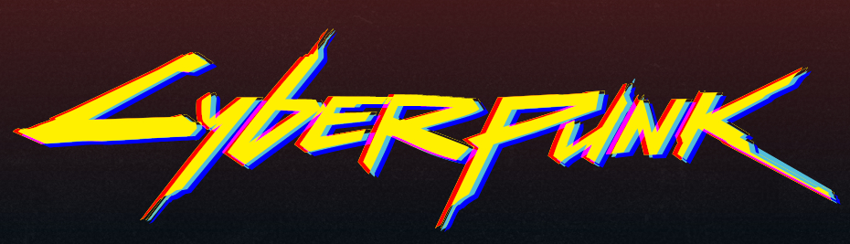
Filter 1: Chromatic Aberration
If you are a photographer, or wear glasses you have possibly seen this (usually unwanted) effect before.

In optics, chromatic aberration (CA), also called chromatic distortion and spherochromatism, is a failure of a lens to focus all colors to the same point.[1]
https://en.wikipedia.org/wiki/Chromatic_aberration
Recreating this effect
This took some tweaking and fiddling to create, since I wanted it a particular way (and I am complete beginner with filters).
The effect has a blue drop shadow, and a red tint to the left. If you look closely you can see it is not a duplicate layer below the yellow letter, but a part of the the original layer is tinted red.
The top layer(yellow letters) is also shifted a few pixels to the left. And the edges colours blend to create pink tones (not my original intention, but it does add to the effect…).
The SVG filter:
<filter id="Chromatic_aberration">
    <feOffset in="SourceGraphic" result="pre-red" dx="-6" dy="-0"></feOffset>
    <feOffset in="SourceGraphic" result="yellow" dx="-6" dy="-0"></feOffset>
    <feOffset in="SourceGraphic" result="pre-blue" dx="4" dy="4"></feOffset>
    <feColorMatrix
        in="pre-red"
        type="matrix"
        result="red"
        values="0 0 0 0 1
                0 0 0 0 0
                0 0 0 0 0
                0 0 0 1 0"
    ></feColorMatrix>
    <feColorMatrix
        in="pre-blue"
        type="matrix"
        result="blue"
        values="0 0 0 0 0
                0 0 0 0 0
                0 0 0 0 1
                0 0 0 1 0"
    ></feColorMatrix>
    <feBlend mode="lighten" in="red" in2="blue" result="main"></feBlend>
    <feBlend mode="multiply" in="main" in2="SourceGraphic" result="main1"></feBlend>
    <feComposite in="SourceGraphic" in2="main1" operator="xor" result="comp"></feComposite>
    <feMerge>
        <feMergeNode in="yellow"></feMergeNode>
        <feMergeNode in="comp"></feMergeNode>
    </feMerge>
</filter>
What is going on here?
Hopefully you have read some of the resources posted earlier, and can understand some of this. But basically what is happening is we are feeding one effect into another to create a result, then blending and merging them together. It is similar to applying effects one after the other on your image editor of choice.
Note: You can go through the SVG on codepen and comment lines out to see how each step works and how it combines into the final effect.
Lets walk through the filter primatives and show what each one does:
<feOffset>
<filter id="Chromatic_aberration">
    <feOffset in="SourceGraphic" result="pre-red" dx="-6" dy="-0"></feOffset>
    <feOffset in="SourceGraphic" result="yellow" dx="-6" dy="-0"></feOffset>
    <feOffset in="SourceGraphic" result="pre-blue" dx="4" dy="4"></feOffset>
    <feColorMatrix
...
Take the ScourceGraphic use <feOffset> to move it left 6 pixels, and store the result‘s in variables named pre-red and yellow. Then do the same but instead move it down and to the right 4 pixels, and store it as pre-blue.
The ScourceGraphic is the the cyberpunk logo, but just the #Top_Cyberpunk layer, since that is the part I apply the filter to.
Note: You can apply SVG filters to a part of the SVG like I have done here; to all of it, or any other element on the page. The ‘ScourceGraphic’ will be whatever your filter is applied to.
<feColorMatrix>
...
<feOffset in="SourceGraphic" result="pre-blue" dx="4" dy="4"></feOffset>
    <feColorMatrix
        in="pre-red"
        type="matrix"
        result="red"
        values="0 0 0 0 1
                0 0 0 0 0
                0 0 0 0 0
                0 0 0 1 0"
    ></feColorMatrix>
    <feColorMatrix
        in="pre-blue"
        type="matrix"
        result="blue"
        values="0 0 0 0 0
                0 0 0 0 0
                0 0 0 0 1
                0 0 0 1 0"
    ></feColorMatrix>
    <feBlend mode="lighten" in="red" in2="blue" result="main"></feBlend>
...
This is pretty simple operation, just take pre-blue and pre-red, use <feColorMatrix> to change their colour, and store the result as blue and red:
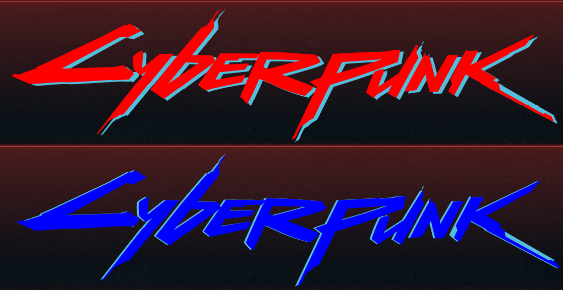
<feColorMatrix> used to create blue and red result<feBlend>
...
></feColorMatrix>
    <feBlend mode="lighten" in="red" in2="blue" result="main"></feBlend>
    <feBlend mode="multiply" in="main" in2="SourceGraphic" result="main1"></feBlend>
    <feComposite in="SourceGraphic" in2="main1" operator="xor" result="comp"></feComposite>
...
Using <feBlend> to combine or ‘blend’ two layers, similar to what you would do in an image editor. And using mode to set how to blend them. you have the same options as in photoshop/gimp:
normal | multiply | screen | darken | lighter
<feBlend>. Top: using ‘lighten’ mode , bottom: using ‘multiply’ to create main1.<feComposite>
...
<feBlend mode="multiply" in="main" in2="SourceGraphic" result="main1"></feBlend>
    <feComposite in="SourceGraphic" in2="main1" operator="xor" result="comp"></feComposite>
    <feMerge>
...
Taking main1 from the previous step, and using <feComposite> to punch a cyberpunk shaped hole in it via the ScourceGraphic, resulting in comp.

<feComposite> you can see the second layer (light blue) though the middle of the letters<feMerge>
...
<feComposite in="SourceGraphic" in2="main1" operator="xor" result="comp"></feComposite>
    <feMerge>
        <feMergeNode in="yellow"></feMergeNode>
        <feMergeNode in="comp"></feMergeNode>
    </feMerge>
</filter>
Using <feMerge> to stack the previous comp result onto the yellow result from step 1. comp acts as a kind of outline to the yellow result, giving the final effect that I wanted.

<feMerge>Animating
This is pretty simple really, all I have done is create a class with the filter applied (to the top layer of the SVG). Then use JavaScript to add that class for a short period, and remove it again.
svg #Top_Cyberpunk.ca_filter {
  filter: url("/#Chromatic_aberration");
  -webkit-filter: url("#Chromatic_aberration");
}
Filter 2: Distortion effect
This is not my original effect, this was a modified version from this tutorial on codrops: Distorted Button Effects with SVG Filters.
I will give a very basic explanation here, but for more info I recommend clicking on the link.
How it works
<filter id="Analog_noise">
<feTurbulence
type="fractalNoise"
baseFrequency="0.0001 0.0001"
numOctaves="1"
result="warp"
></feTurbulence>
<feDisplacementMap
xChannelSelector="R"
yChannelSelector="G"
scale="30"
in="SourceGraphic"
in2="warp"
/>
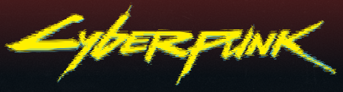
</filter><feTurbulence>
First <feTurbulence> creates perlin noise, using the baseFrequency property to set how much noise is applied on each axis. The first number is x, then y.
Here it is ‘0.001’ for both, because we want to start off with zero noise and then animate it in on the x axis.
<feDisplacementMap>
This uses the pixels from in2 to displace the pixels within in. So in our example we use the distortion/noise from warp created by <feTurbulence>, and use that to displace the pixels in ScourceGraphic (aka what you apply the filter to, in our case the cyberpunk logo)
Animating
Like I mentioned, we animate this by increasing, then decreasing the x axis of <feTurbulence> via the baseFrequency property. The original tutorial used GSAP (v2), which really is made for this kind of animation. So I modified it and used it here (but updated to v3).
Ok, the code for animating the ‘glitch’ effect (which I have called ‘analog noise’ in my codepen) :
const analogNoiseTl = analogNoise().pause();

//Analog noise effect
function analogNoise() {
  let turbVal = { val: 0.000001 };
  const turb = document.querySelector("#Analog_noise feTurbulence");

  const tl = gsap.timeline({
    onUpdate: function () {
      turb.setAttribute("baseFrequency", "0 " + turbVal.val);
    }
  });

  tl.to(turbVal, 0.2, { val: 0.9 });
  tl.to(turbVal, 0.2, { val: 0.000001 });

  return tl;
}
This is a function that returns a GSAP timeline (the animation sequence). On the first line, I have already assigned a copy of the timeline to a variable (hoisting) and immediately paused it. I can /play/pause/restart etc it later.
Inside that function There are two variables, turbVal and the actual filter element that we want to animate a property of <feTurbulence>.
...
let turbVal = { val: 0.000001 };
const turb = document.querySelector("#Analog_noise feTurbulence");
..
TurbVal is what we will be ‘tweening‘, instead of the property directly. Lets skip a few lines to that part, since I feel it is easier to understand:
...
tl.to(turbVal, 0.2, { val: 0.9 });
tl.to(turbVal, 0.2, { val: 0.000001 });
...
Here we tell the timeline to set turboVal.val to 0.9, but do it gradually over 0.2 seconds or ‘tween’ it. And on the next line we tween it back to 0.000001 over 0.2 seconds.
Okay, but how does that apply to the filter element if we are just updating a variable?
When we created the timeline above, we set the onUpdate callback function:
const tl = gsap.timeline({
    onUpdate: function () {
      turb.setAttribute("baseFrequency", "0 " + turbVal.val);
    }
});
This runs everytime the animation is updated, which I believe is based on requestAnimationFrame().
Within this function is where we set the filter element’s <feTurbulence baseFrequency=""> property, using the continuously updated (while the animation is running) turbVal.val. Thus making the cyberpunk logo look all fuzzy.
The Background
I wanted an interesting background for this, instead of a block of plain colour. So I created a kind of dirty old noisy CRT screen effect as the background. Using a similar colour palette as the in game UI.
The effect is pretty subtle, but it came out good, imo.
How it is done:
There are a few parts to this that I will break down here.
Dirt + colour background

This is done in just two lines of CSS applied to the body element:
background: rgb(60,20,21);
background: linear-gradient(180deg, rgb(78 26 27 / 96%) 0%,
            rgba(6,13,19,0.96) 78%),
            url(https://i.imgur.com/vCGkonp.jpeg);
This is a basic gradient, along with this texture image, Using the RGBA(a for alpha..) values to adjust the opacity of the gradient on top of the texture, so it just kind of peeks through.
Glowing outline
This is created with .content-wrapper:after, a psuedo element. Because I did not want the drop-shadow to apply to the logo too. Also for sizing reasons.
.content-wrapper:after {
  content: "";
  width: 100%;
  height: 100%;
  display: block;
  position: absolute;
  top: 0;
  left: 0;
  outline: 1px solid #ee4d45;
  filter: drop-shadow(0px 0px 6px red);
  outline-offset: -10px;
  margin: 0;
  box-sizing: border-box;
  pointer-events: none;
}
And to animate it we start off with .flash-outline class added to the element in the html. Which immediately plays a keyframe animation upon loading:
.content-wrapper.flash-outline:after {
  animation: dimOutline 0.2s infinite;
}
@keyframes dimOutline {
  to {
    outline: 1px solid #b33e38;
    filter: drop-shadow(0px 0px 3px red);
  }
}
This rapidly dims the outline and drop shadow, giving a flashing effect.
It is only playing during the beginning, then the class is removed again stopping the effect. leaving a static glowing outline. This is sequenced and synced with other animations using GSAP timelines. (such as the dimming of the background)
Background Noise
This is running all the time in the background. If you look closely, it looks similar to the static noise you get on old televisions.
This is another SVG filter to make the noise, applied to an oversized element , then animated with CSS keyframes to move it ‘randomly’ across the background.
<!-- Screen noise -->
<filter id="noise" x="0vw" y="0vh" width="100vw" height="100vh">
    <feFlood flood-color="#808080" result="neutral-gray" />
    <feTurbulence in="neutral-gray" type="fractalNoise" baseFrequency="0.3" seed="1" numOctaves="10" stitchTiles="stitch" result="noise" />
    <feColorMatrix in="noise" type="saturate" values="0" result="destaturatedNoise"></feColorMatrix>
    <feComponentTransfer in="desaturatedNoise" result="theNoise">
        <feFuncA type="table" tableValues="0 0 0.2 0"></feFuncA>
    </feComponentTransfer>
    <feBlend in="SourceGraphic" in2="theNoise" mode="soft-light" result="noisy-image" />
</filter>
body:after {
animation: screenNoise 2s steps(10) infinite;
filter: url(#noise);
content: "";
height: 300%;
left: -50%;
opacity: 0.12;
position: fixed;
top: -110%;
width: 300%;
z-index: 0;
}
/* Keyframes */
@keyframes screenNoise {
0%,
100% {
transform: translate(0, 0);
}
10% {
transform: translate(-5%, -10%);
}
20% {
transform: translate(-15%, 5%);
}
30% {
transform: translate(7%, -25%);
}
40% {
transform: translate(-5%, 25%);
}
50% {
transform: translate(-15%, 10%);
}
60% {
transform: translate(15%, 0%);
}
70% {
transform: translate(0%, 15%);
}
80% {
transform: translate(3%, 35%);
}
90% {
transform: translate(-10%, 10%);
}
}Full disclosure, neither of these are my original code, the SVG filter noise was copied from stack overflow, and the animation was from a codepen article, which originally used an image applied as a CSS background. I just smushed them together.
Animated background lines
You see these in the beginning and upon holding down the mouse button anywhere on the page. It adds to the sort of glitchy/interference effect.
This uses the same animation from above, but I swapped the SVG filter.
body.lines-background:after {
  filter: url(#screenLines);
}
The SVG filter is just a modified version of the noise filter above. The only difference is I adjusted <feTurbulence> to only create noise along the X-axis, similar to our glitch filter on the logo:
<!-- Screen lines -->
<filter id="screenLines" x="0vw" y="0vh" width="100vw" height="100vh">
    <feFlood flood-color="#808080" result="neutral-gray" />
    <feTurbulence in="neutral-gray" type="fractalNoise" baseFrequency="0.001 10" numOctaves="10" stitchTiles="stitch" result="noise" />
    <feColorMatrix in="noise" type="saturate" values="0" result="destaturatedNoise"></feColorMatrix>
    <feComponentTransfer in="desaturatedNoise" result="theNoise">
        <feFuncA type="table" tableValues="0 0 0.2 0"></feFuncA>
    </feComponentTransfer>
    <feBlend in="SourceGraphic" in2="theNoise" mode="soft-light" result="noisy-image" />
</filter>
And that’s it. Mostly..
The rest of the work was using GSAP to make sequences of animations using these effects. But since this is not a GSAP tutorial (and is long enough already), I will not go into detail…
If you made it this far you are a trooper. Leave a comment below if this was any help, or just a bunch of rambling gibberish.
Nick